-
Patagonia Ads

I found this on Behance and this is the link: https://www.behance.net/gallery/65530047/Patagonia-Ads

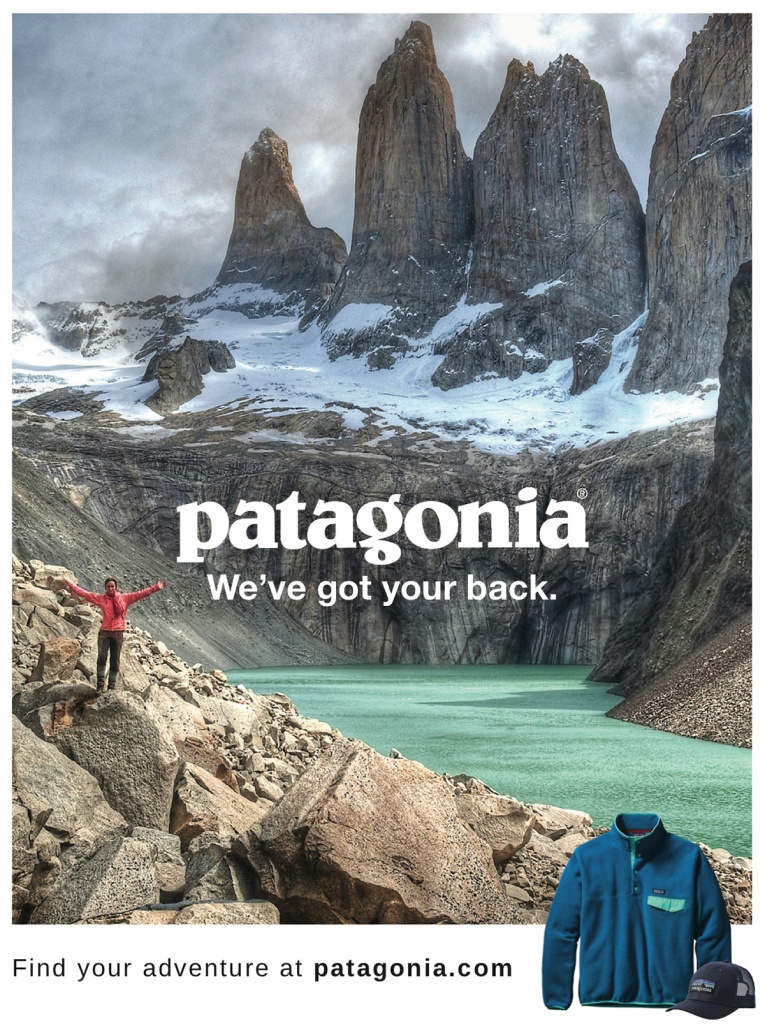
The contrast of the white letters on the dark mountains makes it pop out. They are legible and draws your attention there.

This ad does a good job at repeating there colors. The border around the around ad, the main words, the snow on the mountains all work well because they are the same color. The use of the green/teal color was also repeated with one of their jackets and the lake at the bottom of the mountains. Also they used very short phrases, one liners throughout the ad.
With each text there is something next to it. The bottom leads the viewer right to a couple of the their products. The lady posing in the picture also draw attention to the center of the image which is where we read about Patagonia.
The brand name is much larger and a more interesting font. While the other two pieces of text are smaller, and a more a basic reading text as to not draw too much attention, but to attract a little more than the background.
I created this ad.

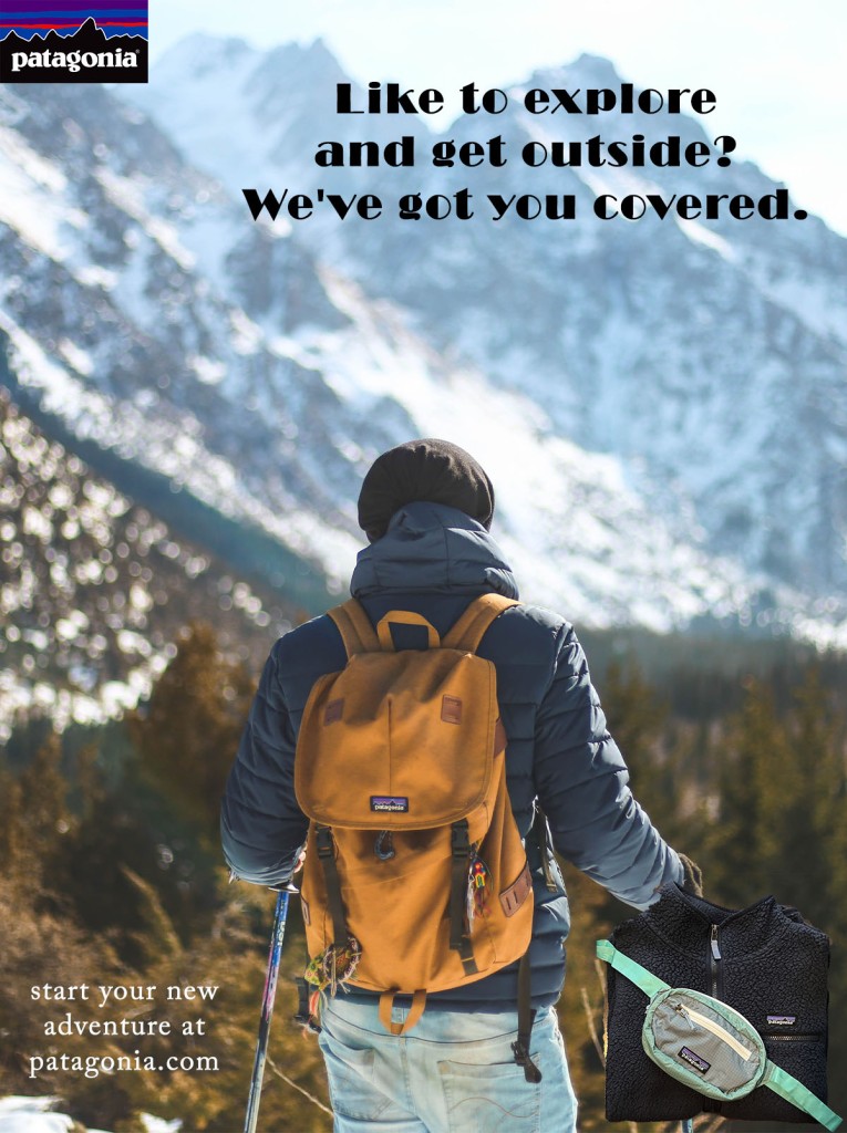
The contrast between the text and their backgrounds makes them more noticeable. They are easy to read and it is very clear.

The two jackets used in the article are both navy blue. The logo was used multiple times in this ad and even by itself in the top left corner. The backpack the guy is using is almost the same color as the background trees.
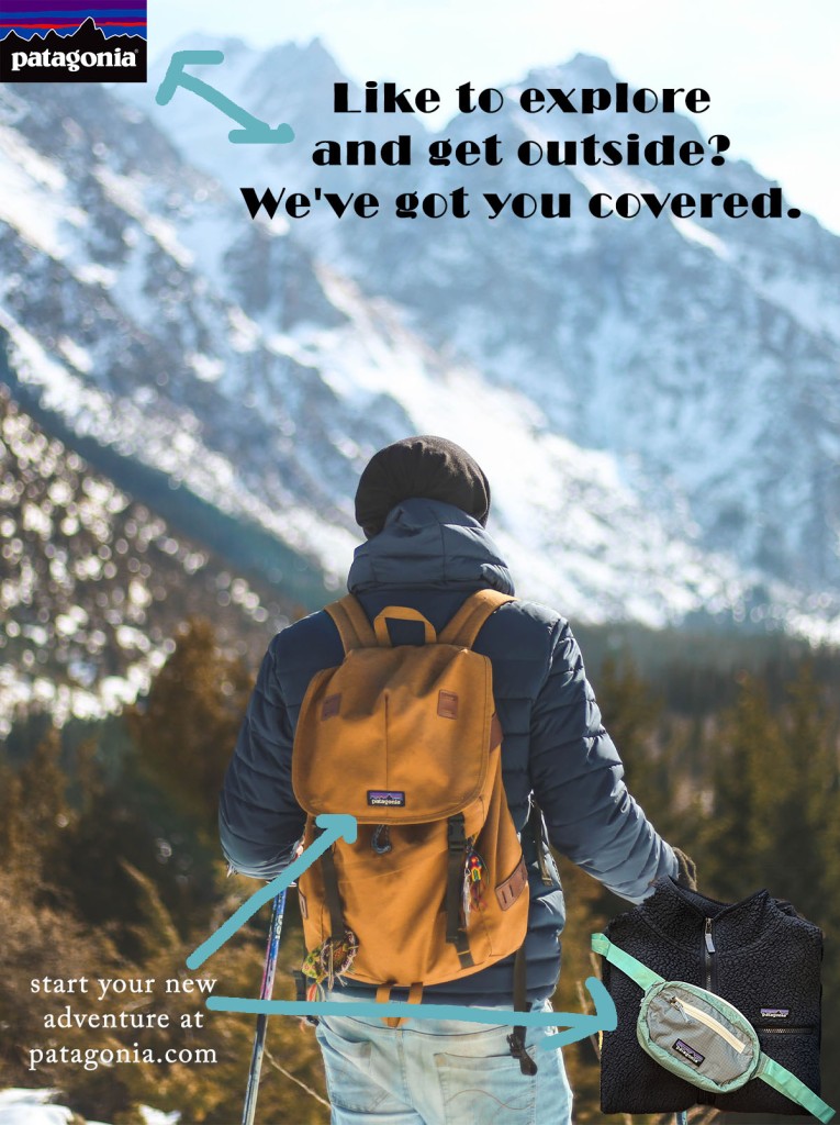
The logo is in proximity of the text showing that Patagonia is the one who has them covered. As well as the bottom, the logos and products of Patagonia are close to the text telling viewers where to get these products.

The tagline is a lot bolder and larger while the invitation is smaller in the corner and doesn’t draw too much attention. The fonts are different making the larger text a little more fun to read and catchy.
Conclusion: While these two ads are not the exact same, they are portraying the same message. Patagonia is here to help people adventure. The color scheme is similar between the two ads and the layout has some similarities. For example, having more products for viewers to look at in the bottom right corner is the same layout. The typography is not the exact same, but both follow the same pattern.
-
Kitchen Magazine Spread
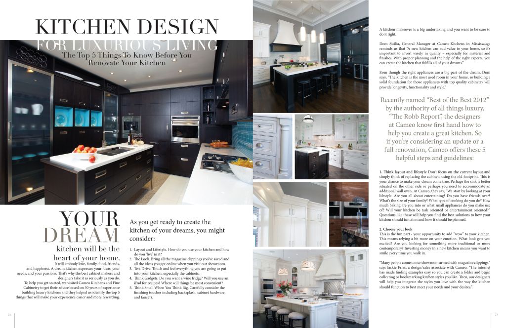
I found this kitchen magazine spread on google. I do not have the designer’s name. It looks to be from Pinterest though.

Typefaces:
The title is in the Modern typeface. As you can see there are pretty distinctive thick and thin transitions in the strokes. There are serifs on the tops and bottoms of the letters that are thin and horizontal.
The subtitle is in the Oldstyle typeface. There is not any drastic thick and thin transitions in the strokes. The serifs in this font are slanted. This doesn’t really call a lot of attention which makes it a good body/subtitle typeface.

Typeface contrast:
As you can see the title is bigger than the subtitle. This spread also you multiple colors for the title and stuck to just one for the subtitle. Also there is more kerning applied to the subtitle which you can see because the letters are a lot closer together than the title. The weight of the title is a lot bigger than the subtitle.
Rule of Thirds:
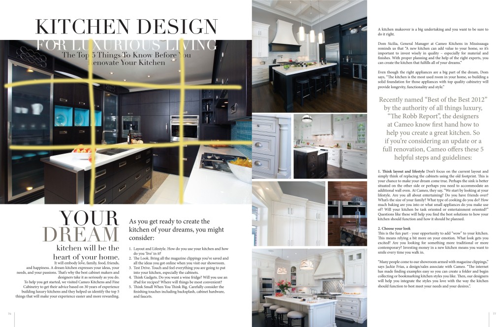
Of course you would want to look at the new, shiny appliances. The oven is placed roughly on a line in the right third portion of the image. It draws attention.

The first picture mimics the picture up close to the appliances and it is decorative. The second picture shows are a higher angle and the rule of thirds could be applied to the where the cabinets are which was the focus I was going for. The third picture shows the depth and how the bar lights look a lot bigger because they are closer to the camera than everything in the background.
Conclusion:
This is a good magazine spread. It gave a lot of variety in the pictures, with leading lines, depth, and the rule of thirds. There were a few different typefaces which also added a good variety to the spread. Also the lighting really lightened and at different points it was a bit darker.
-
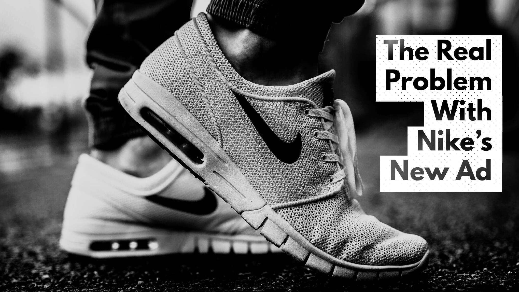
Nike Ad
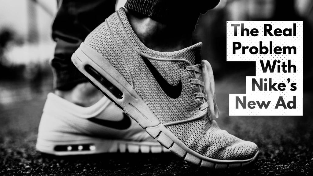
This is an ad for Nike that I found on google. This is the link for the ad. https://www.brandonhilgemann.com/wp-content/uploads/2018/09/The-Real-Problem-With-the-New-Nike-Ad.jpg This ad was made by Brandon Hilgeman.

Contrast
The words pop out because of the white outline against the dark background. The shoes do the same thing since they are white as well.
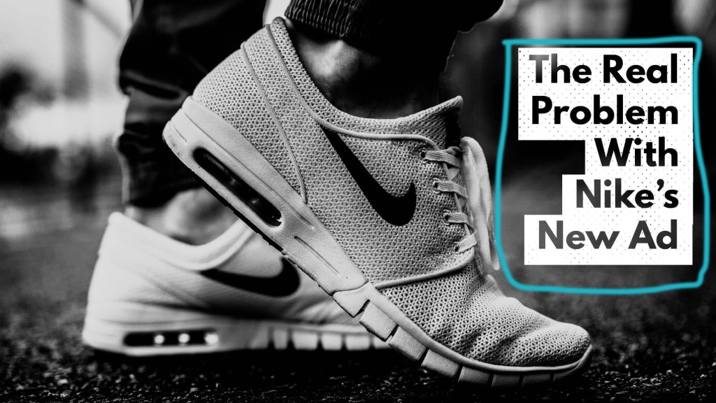
Repetition
The designer used the same font for the caption and had one to two words per line to keep it skinnier in size.
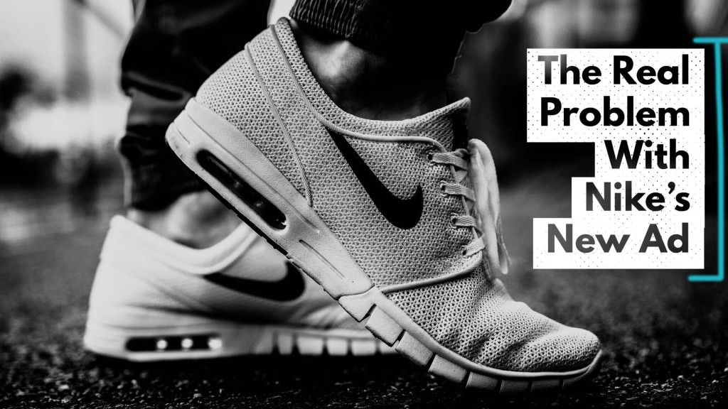
Alignment
As you can see there is a left alignment with the caption. On the other hand the shows are in the middle as more of the focus of the ad.

Proximity
The words are all spaced evenly. The caption and the shows are very close to each other to show that they are both connected and are about Nike.
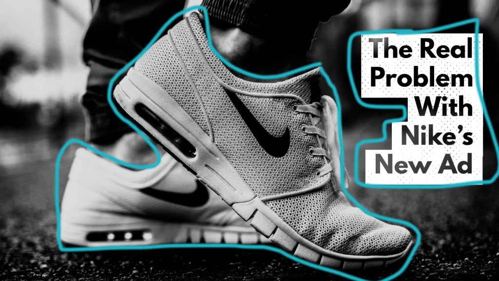
Color
There isn’t a whole lot of color, but the shoes and the caption are bright to show that they are the focus of the ad.
-
Subscribe
Subscribed
Already have a WordPress.com account? Log in now.
