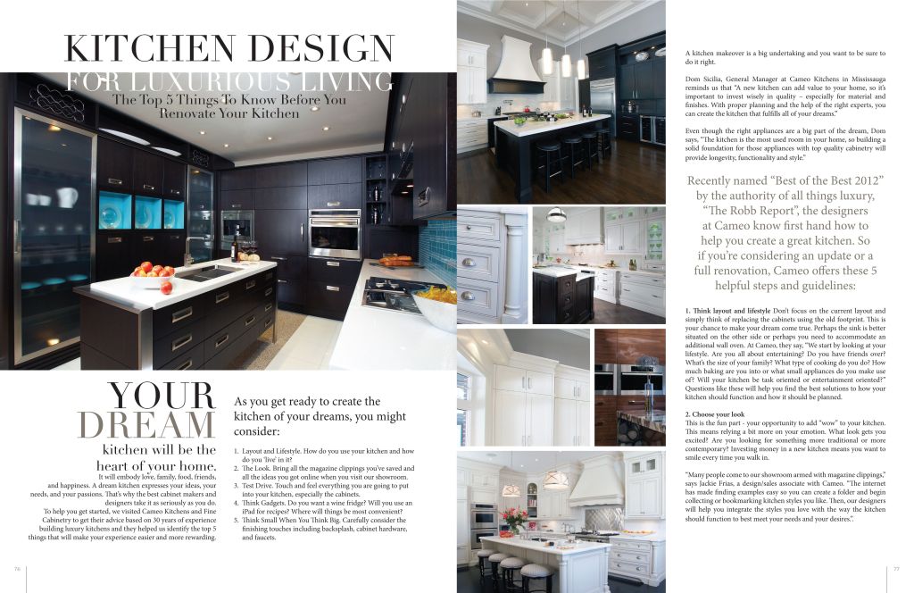
I found this kitchen magazine spread on google. I do not have the designer’s name. It looks to be from Pinterest though.

Typefaces:
The title is in the Modern typeface. As you can see there are pretty distinctive thick and thin transitions in the strokes. There are serifs on the tops and bottoms of the letters that are thin and horizontal.
The subtitle is in the Oldstyle typeface. There is not any drastic thick and thin transitions in the strokes. The serifs in this font are slanted. This doesn’t really call a lot of attention which makes it a good body/subtitle typeface.

Typeface contrast:
As you can see the title is bigger than the subtitle. This spread also you multiple colors for the title and stuck to just one for the subtitle. Also there is more kerning applied to the subtitle which you can see because the letters are a lot closer together than the title. The weight of the title is a lot bigger than the subtitle.
Rule of Thirds:
Of course you would want to look at the new, shiny appliances. The oven is placed roughly on a line in the right third portion of the image. It draws attention.

The first picture mimics the picture up close to the appliances and it is decorative. The second picture shows are a higher angle and the rule of thirds could be applied to the where the cabinets are which was the focus I was going for. The third picture shows the depth and how the bar lights look a lot bigger because they are closer to the camera than everything in the background.
Conclusion:
This is a good magazine spread. It gave a lot of variety in the pictures, with leading lines, depth, and the rule of thirds. There were a few different typefaces which also added a good variety to the spread. Also the lighting really lightened and at different points it was a bit darker.

Leave a comment